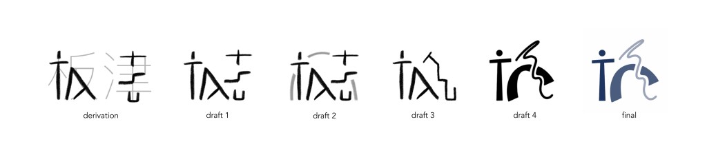
The logo was designed by Yasha Lai. The base form comes from the Chinese characters for Itatsu. The figure on the left symbolizes a person and represents human agency. The arch symbolizes efforts the lab makes to bring inclusivity for marginalized populations in society, and the wiggly line symbolizes the messy movements of the human condition, which drives us to make nuanced interpretations of our lived experiences.
このロゴは研究室メンバーのヤシャ・ライがデザインしました。「板津」の漢字を元にしています。左は人を象徴し、人間の主体性を示しています。 アーチは、社会の疎外された人々を包摂することに努めようという研究室のスタンスを象徴し、波打つ線は人間の営みの乱雑で厄介な動きを象徴しており、私たち人間の生きた経験について機微をうがつような研究を目指す姿勢を表しています。

Leave a comment